Our Kepler-186f paper came out last week and we got a lot of press attention (lots more than I expected!). Tim Pyle and Robert Hurt at Caltch/JPL did an amazing job of of creating a beautiful image which was shown around the world on TV and in print.

Artists concept of the Kepler-186 system by Tim Pyle and Robert Hurt. Clicking on this will take you to the full image which is fantastic!
I received a couple of questions from people about why the image looks the way it does and whether there is some scientific basis to the depiction. First, I want to say that the magic was all performed by the artists at Caltech/JPL. However, Elisa Quintana and I discussed with them at length about how we wanted the planet to look. There was a lot of very fun back-and-forth where we tweaked things to get them how we wanted. The artists turned our blurry vision into a high resolution reality (if I sound gushing here it’s because I am truly in awe of their work).
The information we have at hand are the size of the planet, the size and temperature of the star and the distance the planet is from the star. This actually provides us with quite a bit of information to work with.
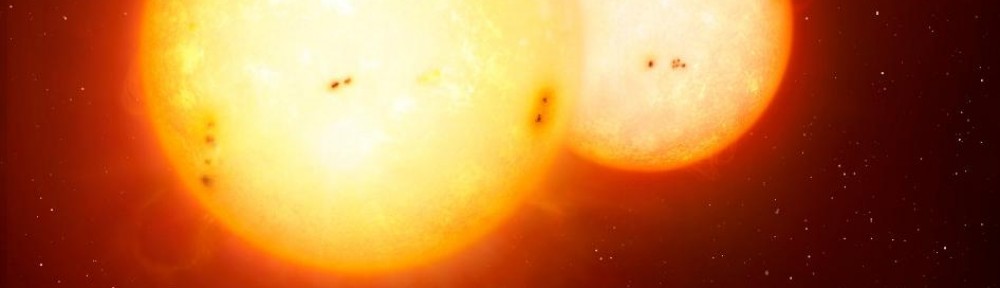
The temperature of the star is roughly 3800 Kelvin. There has been some interesting work on convolving the spectrum of various stellar types with the response function of the human eye. Without an atmosphere, the Sun would appear almost white to our eyes (not yellow as you might imagine). We started with using the correct color for this star. However, rendering the star the true color made it look very much how we might imagine the Sun to be (i.e. a yellow/orange color). Part of the story we wanted to tell was that this star is not Sun-like, so we did make the star slightly more orange than it would really appear (the color show is correct for a star a few hundred Kelvin cooler).
The planet is bathed in orange light from the star, the planet receive the correct level of illumination from the star given its orbital distance. We wanted to show the planet illuminated and also show the star. This meant we had to alter the angle of incoming light from the star in order to see some of the planet’s surface. In essence, the star is shown at the wrong phase angle relative to the planet. If we didn’t do this we would only see the night side of the planet which would be fairly boring and not allow us to show a depiction of surface conditions on the planet.
The planet is shown with yellowy continents and grey/blue oceans. There are ice caps and clouds that appear orangey. Oceans on the Earth appear a deep rich blue color, this is because of the blue light from the Sun Rayleigh scatters off the ocean. This star emits very little blue light which we represented by making the sea a dull grey/blue color. Ice and clouds Mie scatter light which is fairly uniform across all wavelengths hence clouds and ice appear the same color as the star. Then we come to the color of the continents – we had fun with this one. When we were designing the image Elisa Quintana found an article by Nancy Kiang titled The Color of Plants on Other Worlds. Nancy is a scientist based at NASA Ames (she moved to Ames from GISS the week after we talked to her, small world heh!) who works with the Virtual Planetary Laboratory. We called her up and chatted about what colors plants might be on planets orbiting cool stars. While this is a very complex issue involving evolution of photosynthesis, she recommended a dark yellow/green color as a potential color for alien planet life on this world.
We wanted to highlight the differences between this world and Earth. The low illumination level is purely because this planet receives less light from its star than we do from the Sun. Because of this lower illumination, we speculated that this planet may be a little colder (note that a planet’s temperature is determined by its atmosphere, something we know nothing about). So we made the planet have prominent ice caps and also had the plant life (i.e. the yellow color on the surface) cluster at the equator, similarly to how we see lots of green colors at mid-latitudes on Earth in temperate regions – temperate regions in the artists concept are clustered around the equator.
Finally, we wanted to depict the other planets. Three of the other planets are clearly seen nearby the star. They are near to the star because they much closer to the star than Kepler-186f. One of my favorite parts of the image is that we have one of the interior planets transiting the star. We wanted to make the planet just large enough to be detectable. This meant increasing its size a little – in reality it would be able 1/30th the size of the star. The purpose of having the planet there was to show how we detect planets with Kepler.
I hope this post has been informative and demonstrates that a lot of thought goes into making these artists concepts. They are necessarily speculative, for instance we don’t know whether the planet has water, continents, ice, clouds etc. but we do know that Earth has these things. Hopefully this image provides a nice tool to explain what might be the same and what might be different between this planet and Earth.
Pingback: Envisioning Alien Worlds
Most interesting is that this moon orbiting Kepler-186f point in the near and not too far from its star. The temperature on the stars contributing to the persistence of liquid water. The opportunity to discover life.
Pingback: Weitere größere Artikel | Skyweek Zwei Punkt Null